WordPress Text-Only Mode: When Simpler Pages Help
Modern WordPress websites can be visually rich and still difficult to read on a small screen or a slow connection. A text-only mode offers an alternative: it gives written content priority and reduces decorative elements that compete for attention. The goal is not to strip meaning from a page, but to make the essential information easier to reach.
What does text-only mode mean?
There is no single WordPress standard for “text-only mode.” Different themes and plugins may simplify typography, hide nonessential media or reduce certain front-end assets. Before adopting any implementation, verify precisely what it changes and whether it still exposes navigation, forms and important product information.
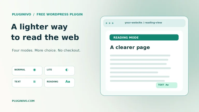
Text-only is not the same as a reader mode, a mobile theme or a system-wide accessibility feature. Our WordPress Lite Mode guide compares several presentation choices and explains why fewer visual distractions can help in some situations.
Four situations where a simpler page may help
- Limited connectivity: A user on an unstable mobile connection may prefer essential text before large decorative imagery.
- Focused reading: Long tutorials may be easier to follow without moving banners or dense sidebars.
- Older hardware: Reducing expensive visual effects may make interactions feel more responsive on modest devices.
- Quick reference: A visitor seeking a specification, address or support instruction may want the answer without waiting for ornamental media.
These benefits depend on the actual implementation. Hiding a background image alone does not guarantee a smaller transfer if the browser still downloads it.
What must never disappear?
Important information must remain available in every mode: headings, labels, error messages, pricing, product compatibility, accessible names for controls, legal notices and the ability to complete essential actions. A shop that hides the checkout button, delivery restrictions or product warnings in its simplified mode has not improved usability.
Keyboard navigation and meaningful focus order are also critical. A text-first visual style is not a substitute for testing with assistive technologies. Test actual screen readers and keyboard interaction instead of assuming fewer images automatically means accessibility.
Performance: test, do not guess
Compare network requests, transferred data and user experience before and after switching modes. Browser developer tools can help you inspect image downloads, JavaScript execution and layout shifts. Clear caches during controlled comparisons and test on a real mobile connection if your audience depends on it.
Measure the core tasks: can visitors find a product, understand a guide and contact support? A simplified page that is visually fast but breaks navigation is not successful. The lighter WordPress website article discusses bandwidth and reading considerations in more detail.
Implement a preference, not a forced experience
Offer a visible way to switch back to the normal layout. Remember the visitor’s preference carefully, without making the site dependent on a tracking system. Ensure language switching, shopping carts and important dialogs continue to work in every view.
Pluginivo Lite Mode FREE provides optional presentation modes for WordPress. Review the actual behavior in a test environment before adopting it on a revenue-critical site.
Frequently asked questions
Does text-only mode automatically make WordPress faster?
No. Speed improves only if expensive resources or rendering work are actually reduced.
Is text-only mode equivalent to accessibility compliance?
No. It can support readability but still needs semantic markup, keyboard operation and accessible forms.
Should every visitor be forced into a simplified view?
Usually not. Give people a choice and preserve complete functionality in each mode.
Takeaway: Treat text-first design as an optional, tested reading experience—not a shortcut that hides important content.